SWATCH is Nykaa’s multi-brand design system. It’s built from ground up to bring consistency and efficiency at scale in front-end development across business verticals. Earlier existing as a style guide, I led the initiative of building it into a thriving design system.
How it started
Previously, there wasn’t a dedicated team working on a design system. Usage guidelines for foundations were in place to help designers. The guidelines also stated UI components, their variants and their suggested usage.
What we wanted to solve with SWATCH
Flexibility
Make SWATCH a breathing system that gives designers and developers flexibility to experiment but not at the cost of usability.

Scalability
Enable teams to build for newer business verticals easily and ensure consistency across the portfolio.

Promote contribution
By putting the right protocols in place, encourage others to contribute towards the design system.
Building the foundations

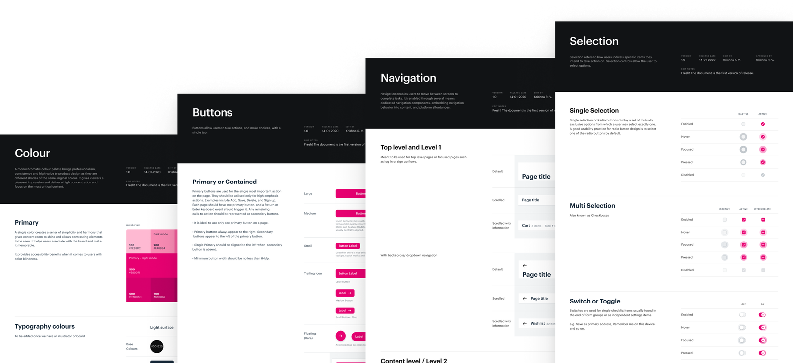
Token architecture
We followed global industry standards in defining our token architecture, and created a structure that can be consumed easily by designers as well as developers. This meant coming up with correct naming conventions, and defining guidelines towards usage of tokens.
Why was this important? Glad you asked.
Theming.
Having abstraction layers allowed for theming that was relevant for any given business.
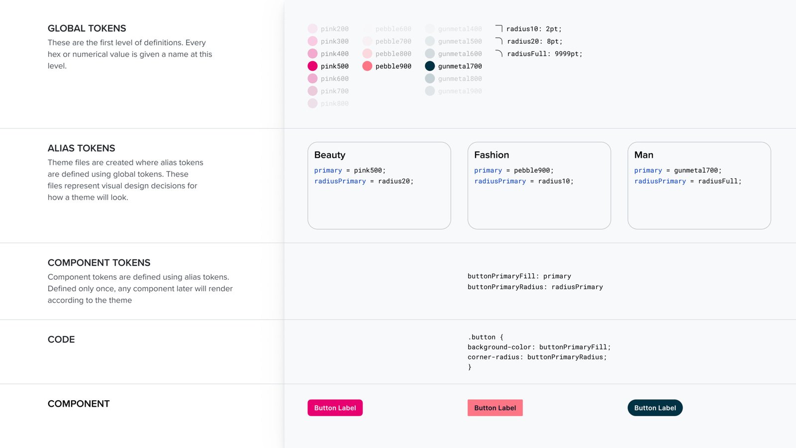
Result?
Having a token architecture resulted in giving enough knobs for designers to tweak the visual look of a brand while ensuring consistency and ease of building for frontend developers.


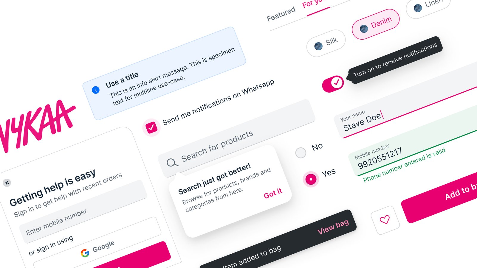
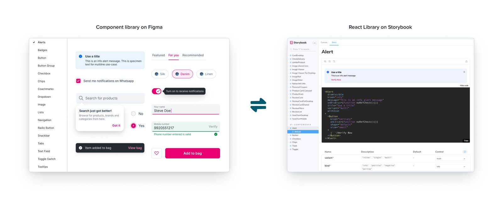
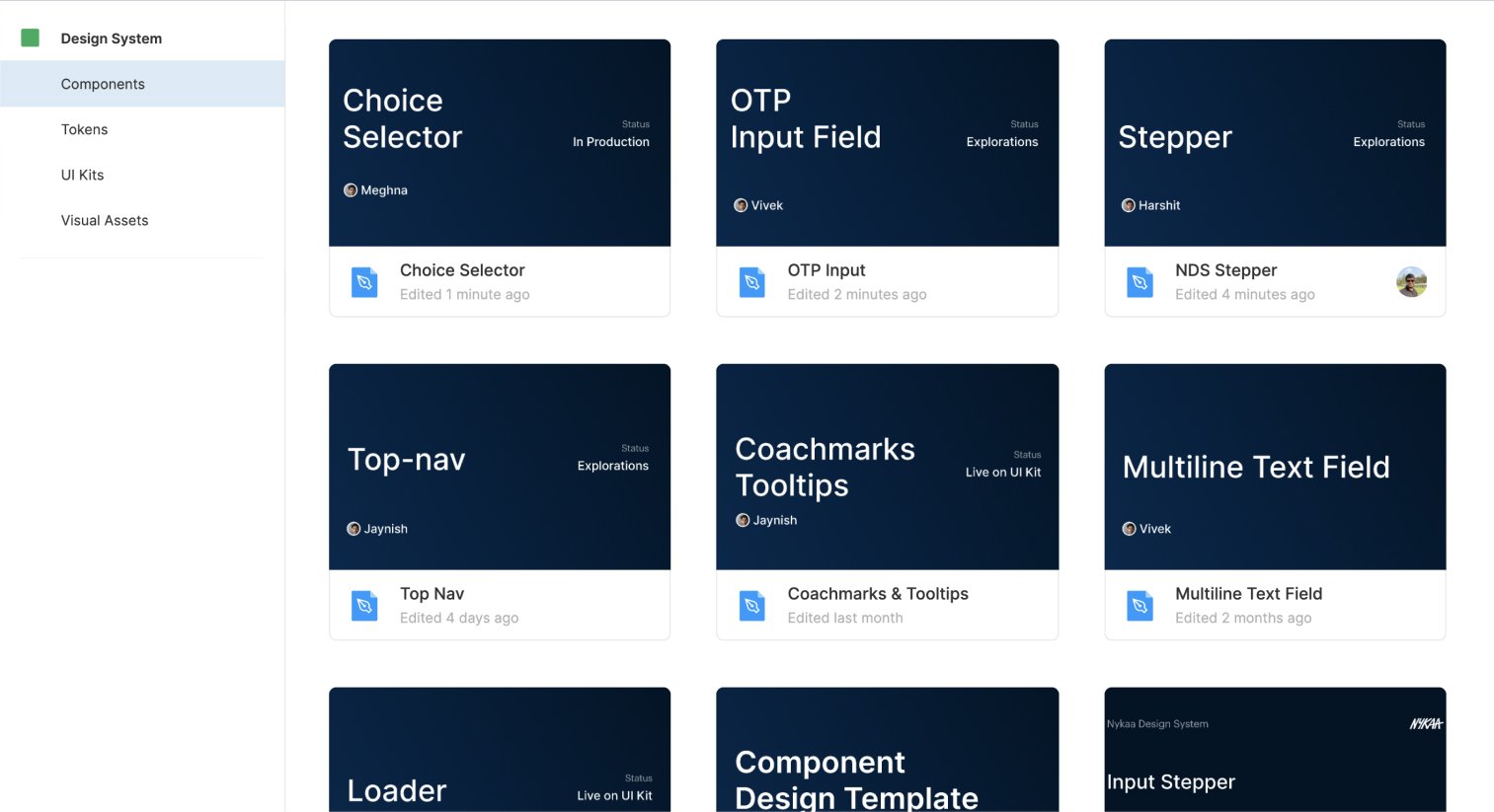
Component Library
Component library became a shared asset collection between designers and developers. The developed version of the library was hosted on Storybook. In most cases, we made sure that there was parity in component naming and properties between Figma and code.

Governance
What started off as a pet project quickly became one of the most discussed projects in the org. Designers and developers became excited to leverage the design system due to the promise of time saved and consistency it could bring not just to the UI but also to their workflows. However, just like handing over the best ingredients doesn’t make one a great cook, we needed to create governance protocols to ensure the audience used the design system as intended and also helped in growing it.
Contribution model
We felt that a design system is a living and breathing document that only becomes better with active feedback and contribution from the people using it. To achieve that, we created a workflow for fellow designers to contribute to the design system.
Other activities
Design system is an ongoing project that couldn’t be built in silos. In order to ensure that the work we did was noticed and communicated to people, we did multiple things.

Workshops and presentations were conducted with the design teams as well as product and development stakeholders to evangelize adoption of design systems.
Slack channels were leveraged to communicate design system updates with the team. A dedicated support channel was used for everyone to share feedback and discuss everything design systems
Video tutorials on platforms such as Loom acted as a great communication tool to asynchronously share tutorials and walkthroughs.
Component libraries alone don’t make up the design system. We worked closely with developers to translate Figma components into interactive artefacts that real users are going to engage with. I headed the roadmap for the design system, built usage as well as documentation for component anatomy and props. Rigorous QA tests were also conducted to ensure there are no gaps between design and code.
Conclusion
This is just the beginning. In my tenure, I set up processes and built the first edition of the component library. Demonstrating the system as working and delivering value helped it gain more adoption. This continues to be an ongoing exercise, and an iterative one at that. Depending on what brings most value to the system’s consumers, and eventually the end-users, the system should continue to evolve to meet these needs.