Building components for the design system is often seen as a visual task—creating variants in Figma and calling it a day. However, it is not just that. What we, as design system practitioners, are really doing is architecting the way our colleagues will use the components to build consistent, scalable UI across products.
This is where component APIs come in: a shared group of controls between designers and developers that allow to fine tune a component’s behaviour, usage, and flexibility.
Figma exposes a subset of this (via properties and variants). However, many important decisions live beyond Figma. This article maps out the major API property buckets that influence component behaviour, and clarifies how designers can contribute meaningfully to them.
API Property Buckets
Each of the following categories help define how a component is structured, how it behaves, and how it can be adapted across use cases.
Event Handlers
These are properties that define how a component reacts to user-triggered events such as clicks or form submissions.
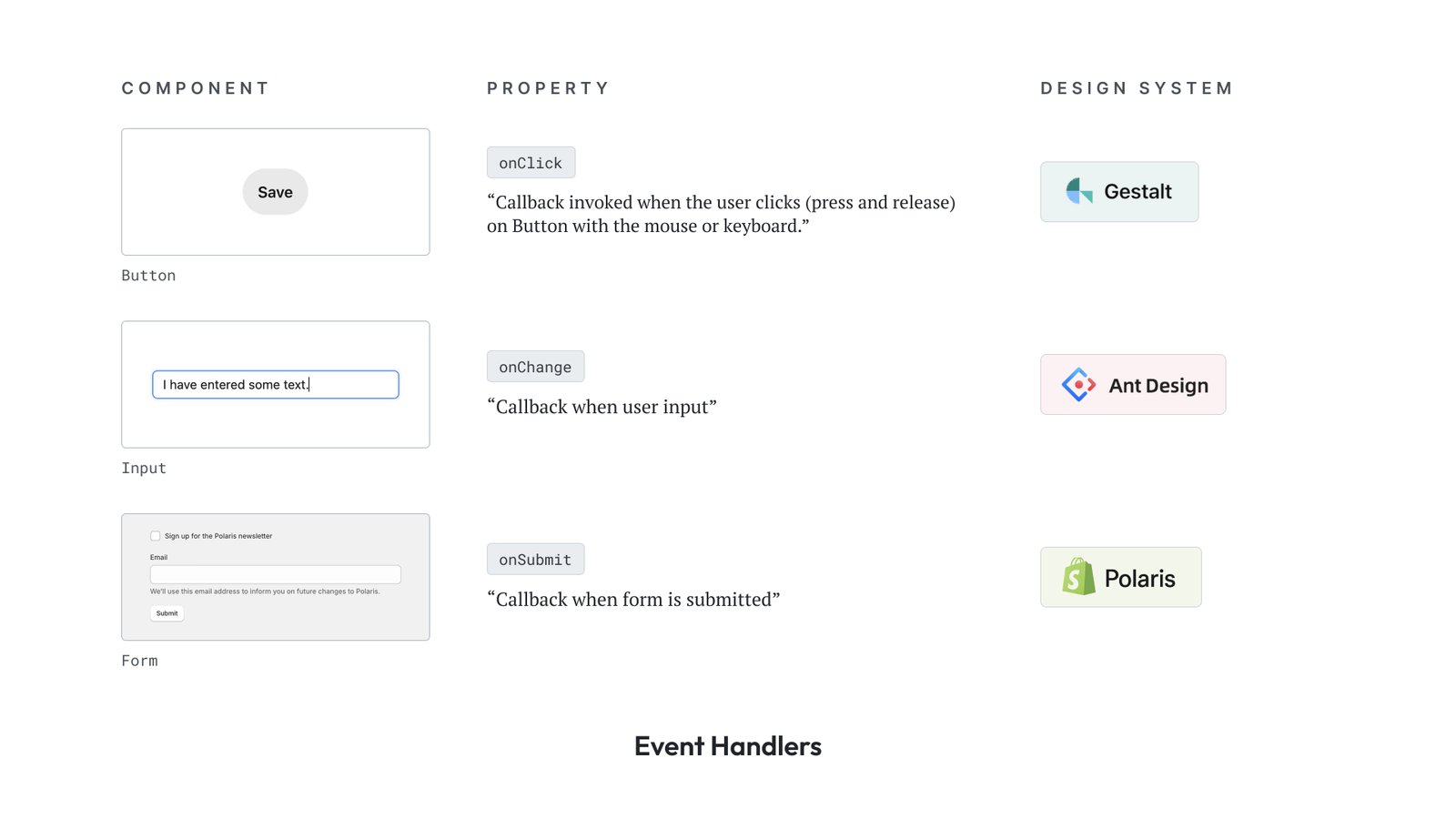
Designer’s Role: Identify key trigger points. What elements perform actions? Where do they take the user next? Annotate interactions clearly in design handoff and flows.
State Management
Defines the current condition of a component—whether it’s loading, open, disabled, etc.
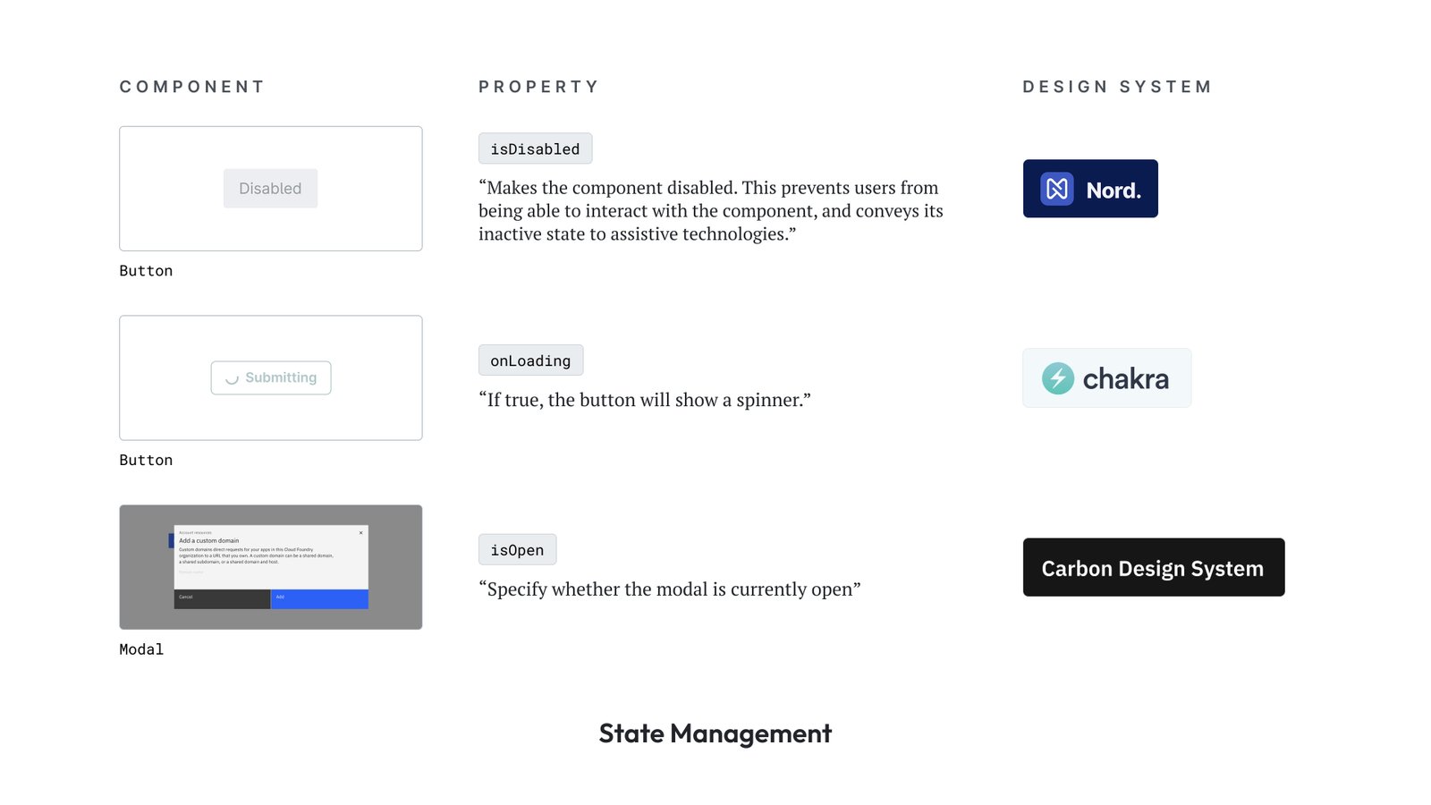
Designer’s Role: Identify and design different states of a component. Collaborate with developers to understand edge cases, if any, that need to be accommodated. Best to use similar terminology for the states in the design tool.
Interaction Controls
Configures how a component responds to user behavior or system-level triggers. These influence—but are not states themselves.
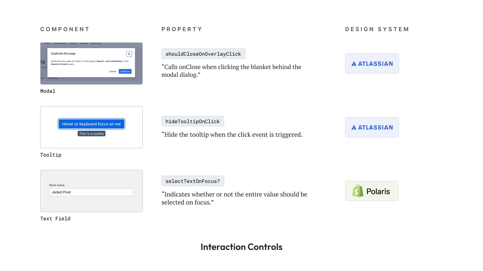
Designer’s Role: These properties may or may not exist in Figma’s component properties panel. But make sure you account for all the ways in which users can interact with the component.
Accessibility
These properties improve a component’s usability for assistive technologies.

Designer’s Role: Use semantic structure and ensure contrast, focus indicators, and keyboard accessibility are covered. Document recommended ARIA attributes and mention them explicitly in component specs.
Styling
Defines visual appearance and layout control.
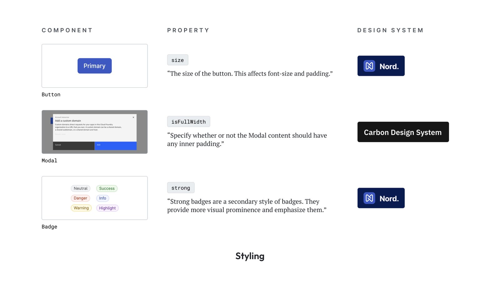
Designers Role: Define and standardise values for style-related props using tokens. Ensure consistency across variants. These typically align well with Figma’s properties and token-based systems.
Modifiers
Affects visibility, structure, or composition—typically toggling the presence or layout of parts of a component.
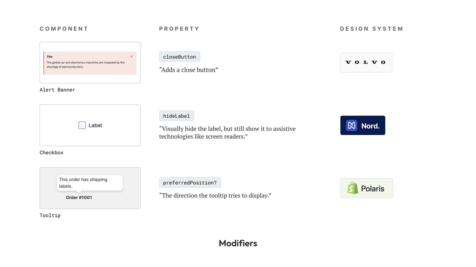
Designers Role: Call out which elements are optional and which are required. Use variants or Boolean properties in Figma when applicable.
Slot
Custom content regions within a component where users can inject additional elements.
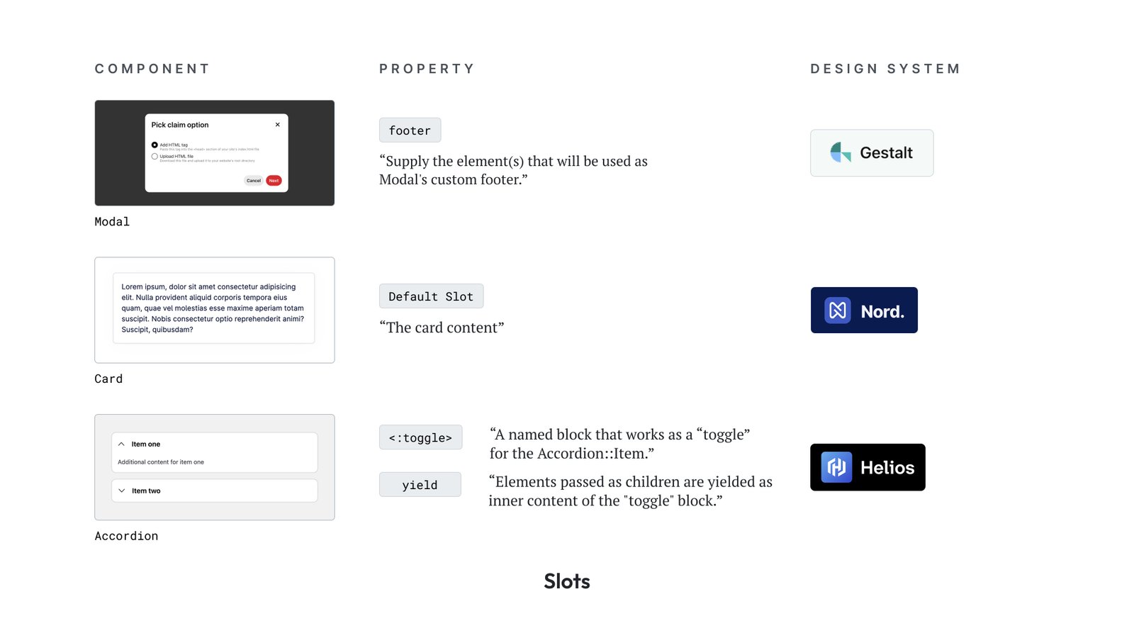
Designer’s Role: Define these as flexible zones. Annotate what kind of content each slot can accept—text, buttons, icons, nested components, etc. Provide usage guidance in docs or examples.
Content
Static, mostly text-based, content inputs that fill component fields.

Designer’s Role: Populate these in mocks with realistic values. Document default content vs. what’s supplied by product designers. Define tone, length, and localisation needs if applicable.
Value Props
Carries data or input values—dynamic or user-generated.
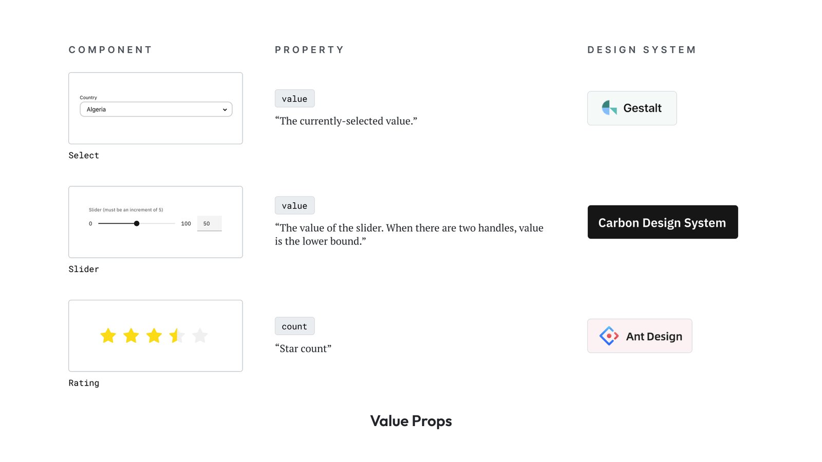
Designer’s Role: Define expected data formats or limits. For interactive components, show examples of selected and unselected states. Collaborate with devs on how changes are surfaced in the UI.
Component-Specific
Unique properties relevant only to specific components due to their functionality or domain logic.
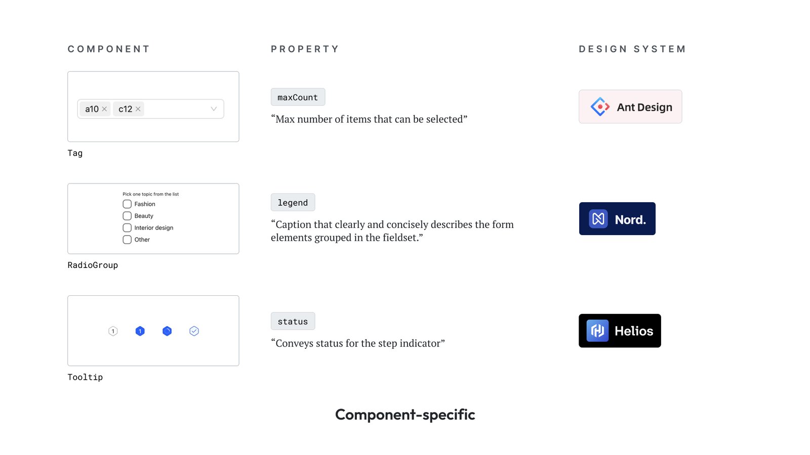
Designer’s Role: Collaborate early with devs to uncover hidden complexity. These often reflect product logic or edge use cases. Make sure these props are documented alongside usage scenarios or design intent.
Conclusion
A clear component API isn’t just for devs. It:
- Sets expectations for how components should behave
- Improves cross-functional collaboration
- Reduces ambiguity in handoff
- Enables better governance and contribution consistency
The more fluently we, as designers, speak the language of component APIs, the more scalable and resilient our systems become.
Use these buckets to guide your component documentation and specs.
Treat this as a shared language, not just a checklist.